Tuesday, December 21, 2010

Final Post - Good Bye!

We are done!!!  Our show was last Friday and I just picked up my portraits and large skeleton from the show room.  Now I am supposed to comment on the final product and my experiences in the class.

I am very happy with the final product here.  I ended up having to reposition the right leg to fit the whole skeleton onto my paper, but I think it turned out polished anyway.  The only problem I have is it looks like my skeleton is in a very awkward position....like he's riding a horse or something!  Not my ideal position to draw and I wish I would have stepped back and actually looked at what repositioning the leg would do to the final drawing. Shoulda woulda coulda.

Anyway, some of the things I am the most proud of this final drawing are the shoulder blades, which I took great care in finding the contour lines and making it look as detailed and not flat as possible, especially the left shoulder blade, which actually looks as if it makes a sharp curve around the rib cage, which is what I was going for to make the whole skeleton look true to it's three-quarter view.  I think the angle of the shoulder blades and collar bone set the tone for the rest the drawing and how far back in space some of the structures went as well as how far forward in space the others came.  I am also proud of the fact that I found some separate bones to draw from close up and personal, like the right hand and the right leg and right foot.  I think this helped me capture the detail necessary for those structures that were forward in space and warranted such detail.  I am also happy that I did not skimp out on finding the structure in the end.  I really pushed myself to mark out the plane changes even in the left arm & hand and left leg & foot even though they were so far back in space that I could not add too much value or contour lines.  I am also proud of the tail bone because this was probably the most difficult bone to see from my position in the room and I got a work out walking back and forth trying to find the structural changes necessary to get the correct value changes, which in the end I ended up not needing as much because I was so proud of my contour lines, and this was such a mid-spacial structure, I didn't want to add too much value anyway.  I am also proud of how much I pushed myself to darken those structures forward in space while being able to go back and work light in those farther back in space structures.  It was difficult for me to do, but because I did it, the drawing looks quite polished and makes sense even though I had a challenging position to work with.

I enjoyed this class immensely, I always enjoy pushing my artistic skills and developing my style.  Finding correct form is such a necessary skill in my field that many designers do not even consider.  Even if you are creating an animated character, if you do not think about the form or the structure you will have problems in the actual animating process because the different structures will not seem believable in movement as a cohesive unit.

Thanks Amy!


Skeleton Drawing Week 3 (for Dec. 19)

Okay, rush time!  I hate that it comes down to the grind and I feel rushed to get things on the page.  On Monday I worked through the entire rib cage and the rest of the spinal column.  It went okay after Amy helped me with the spinal column.  After a while I decided that the bones did not have to look absolutely perfect, as long as I knew what was happening to them and how they generally move and are structured it is okay that they are not perfect likenesses to the bones on the actual skeleton.  Duh.  Why did it take me that long to figure that out?!  I'm a perfectionist, I'm not happy unless it looks exactly like the skeleton I'm looking at.

At this point it is unrealistic to draw this way.  I'm focusing more now on structure and understanding of how these bones fit together, which is actually more rewarding as I'm finding out that I may have to improvise and move one of the legs just to fit the whole skeleton as one piece on the paper.  I thought about chopping off the foot and drawing it separately, but in the end I knew I would not like that it was not a whole structure, so I'm planning on creating my own pose for the lower half.


On Wednesday I completed the torso, including hip bones and tail bone as well as the rest of the arm and hands.  I had to redraw the left hand a couple times, making it arch enough to look believable and like it was actually resting on something.  It was also difficult for me to go back to working light on that arm and hand to make it look like it was back in space, because - unlike my usual technique - for this drawing I'm finding I am having to push myself darker and darker in the front objects to make them appear like they come at the viewer in space.  This is very difficult for me - to not be tempted to go back and smudge in the dark spots to have them blend better because if I did, I would pick up too much material and the darkness would disappear.

I am very proud of the tail bone and right hand here.  I took a long time actually finding the plane changes on the tail bone and actually had to find a separate right hand and look at it close up for this drawing and I think it turned out better because I did that.

Skeleton Drawing Week 2

Hello again.  Continuing on with the "make-up" blog posts here.  The past week I had decided that enough was enough.  There were only so many times I could redraw and redraw again the long axis and framing of my skeleton before I would just have to bite the bullet and get going on really figuring out the structure if I ever wanted to add value tones, which I certainly did want to.  I wanted to continue with the style of drawing that I have thus far exhibited so I would definitely need to add value to my plane changes, which would take a good chunk of the time I needed to draw.

So this week I spent a lot of time on the skull, getting the sizing as close to what I thought would be appropriate to measure the rest of the skeleton from as possible.  It looks fabulous!  I'm actually quite proud of this part, but drawing the skull is second nature at this point so I shouldn't be too excited.  The most difficult part for me is yet to come...the dreaded spinal column!!!!

I began drawing the spinal column of the neck this week also, just so I feel more comfortable finishing the rest of it next week.  This is so hard for me!!!  First of all, I cannot easily see what's going on because the bones are so small and far away, I got a work out just walking back and forth from my drawing board right up close to the skeleton and back again.  I feel like my drawing so far is reflective of my other drawings this semester in a bad way in that I again am relying on value to show plane changes that I have not figured out for myself through structural study.  I am simply drawing what I'm seeing and making it look good to the viewer who stands a few paces away, to whom which my drawing probably looks great!  But come up close and they can see how sloppy my structures really are and how I simply do not understand the structure of each little vertebrae in the spinal column, or at least how to draw them on paper.  It is frustrating, but hopefully I can get some help next week with the rest of it.  The one thing that went very well this week are the shoulder blades, I'm actually very happy with how three-dimensional and touchable these turned out...probably because I actually used contour lines to help me find the values here.


Friday, December 17, 2010

Skeleton Drawing Week 1

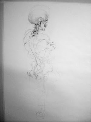
It was the first week on our final project skeleton drawings and here are the spoils of my efforts.  Not much, I know, but I am finding out it takes an awful long time to figure out how exactly the whole form will fit onto the page.  You would think I would have no problem with a six foot piece of paper, well guess again.  I must have redrawn this sort of wireframe rending of the long axis and torso fifty times!  I am starting to regret choosing this weird and challenging angle.  I still don't think it's going to fit quite right, but since I spent all week on this part I really have to move on.

You may have noticed that I cut off the head in the photo, that is not by accident.  The head I drew there was so large I am embarrassed to put it on the internet! haha!  I think when I redraw the cranium and get the spinal cord drawn out things will piece together much better.  One thing I am proud of with this drawing is the long axis and tail bone I drew enough times that I think I got it just right.  Again, this is such a short post, but I just did not do enough to comment on this week.

Post for Nov. 21

This is the first of my make-up posts since I've been negligent to keeping up with posting regularly on Sundays.  This past week we bought our paper and set everything up for our final project: a life-size or larger rendering of the skeleton.  The assignment is to really pay attention to and learn the structure of the skeleton as well as emphasize plane changes with either cross contour, value, or a combination of the two.

I picked out and cut a seven foot sheet of dry wall and decided to stick with a six foot drawing, hopefully covering the real estate of the paper with as much skeleton as possible so it will be about 5 1/2 feet tall.
I picked a spot to draw that would be challenging because I really want to see what I am capable of in this class, now that I have a general style of drawing that I seem to gravitate towards and my skills are getting stronger as the semester has progressed.  We did not get a start on the drawings however, because it is right before Thanksgiving break and it would be best to have a fresh start when we return.


So my post here will be a little short, but I have been doing a little side research of the infant skull after Amy showed me a master sketch of one in one of the books in the classroom.  Here are some pictures I found.  The infant skull is vastly different from the fully grown adult skull, it is amazing!

The most obvious is the difference in the length  and prominence of the mandible.  It is much squatter on the fetal skull.  The frontal bone is much more prominent on the fetal skull and the whole structure is much more compact of course and so the bones tend to look like they don't quite connect and in a lot of cases they don't because fetal skull plates are still molding/connecting into their solid form up until they are 6-8 months old.  I love the way Leonardo da Vinci handles the infant head in his painting here, the roundness of the cranium and puffiness of the cheeks even though the cheek bones are not prominent yet, is perfect.  The jaw may be a little elongated, but it is darn close, especially if this is supposed to be an older baby Jesus, which it looks to be.

Monday, November 15, 2010

Portraits Week II

This week went a lot better, I will say right off the bat.  I don't know if I was just in a better mood to draw or what, but I was able to tackle the unconventional view with relative ease, with Amy helping me with only a few parts.  Here are what those were:

First, the hair.  Enough said, haha!  Well, Amy suggested I try to blend more like I did with Sara's 3/4 back portrait and so I tried.  I like the final result, but I will go back this morning before class and try to define some more of the hair because it still looks a little blocky and the overlapped piece of hair is super dark, which is great, but I would want the rest of the hair to be a bit more shaded as well so the transition is not so harsh.

Second, the ear ended up being WAY far away from the face so in all, her cranium was abnormally large as if gravity was pulling her hair and ear down and away!  So I drew in more hair and redrew the ear in its proper position and it pulled the composition together beautifully.  I was thinking there was something terribly wrong with the structure and it turns out that is exactly what it was.  I am so glad Amy caught and I was able to fix it in class quick before it ended so I could still have the model to do it.  Is this new ear as good as my original?  Not nearly.  I was very proud of my original ear and disheartened that I had to redraw so it just did not turn out the same.
3/4 front

After this unconventional view, I took a look at my two previous drawings and decided I desperately had to go back to my 3/4 front view and fix the shading, it just didn't look like I drew it at all, the style was totally unlike mine and even though I really wanted to explore other styles this semester, I don't think this particular one was successful.  Hopefully it looks a little better, I want to go back
and fix the transition from neck to jaw line.  It, like other aspects of my drawings, ended up too harsh and they almost look disconnected and overlapping, when in fact they do not do that on the live model.

Friday, November 5, 2010

Portraits

3/4 front
This week we worked on our final portraits on our good paper.  I began with the three quarter front view because I wanted to get those facial features out of the way.  In retrospect I probably should have waited because it did not turn out quite like I expected, again probably owing to the fact that I could have used a bit more practice before we started these.  I think it all went down hill when I started to shade the drawing.  I started with the darkest parts first, but I made the left cheek subtle, which makes the eyes look so dark and  raccoon-like.  It seems like an easy fix, though, so I will have to set aside some time on Monday during class to doctor it up a bit.

3/4 back
Second, I did the three quarter back view.  This one went much smoother, but Amy helped me to see a lot of the things I was doing unconsciously.  First of all, I drew highlights in the hair that were too sharp they started to look like stripes so she showed me how to fix them with an eraser (I still have a little work to do there).  She also noticed that I had a lot of thick lines in the hair that outlined and made the sections of hair look flat, I believe I did try to thin those up.  The one thing I still need to work on is the neck, you may have noticed it right away, I made it way too thin.  When you are working on the same drawing for a long time like these drawings sometimes you tend to miss the obvious while you figure out the details.  At least that is what happens to me.


old master portrait - Raphael
I researched a little on old master drawings since I don't have any of the books from class at my disposal.  I found one that I really like because it accomplishes what I am struggling with, shading effectively to show subtle form without harshness and clearly defining the light source by only shading one plane of the cranium.